Conference Room Interior at Bashundhara R/A
Client:
Roodbac
Project Type:
Institutional / Public Interior
Location:
Bashundhara Residential Area, Dhaka.
Duration:
14 days
Area:
975 sq.ft
Project Overview:
The interior space of 975 sq. ft. for Roodbac, located in Bashundhara Residential Area, was developed into a small but very effective hybrid between a fashion show room and a formal conference area. The client needed a place that would allow their clothing to be shown, reviewed and then formally discussed while maintaining clarity and professionalism. The design supports both visual merchandising and decision making by balancing display and discussion. This project’s value is based on its ability to integrate an atelier-like tactile experience with the formality of a boardroom in less than 14 days with a very limited floor plan.
Project Story:
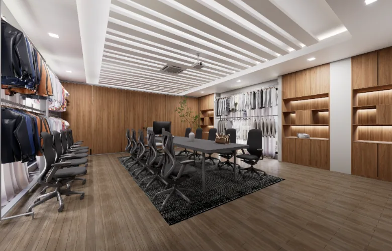
The original premise was a spatial disconnect. A long, thin area would need to serve as both a gallery for clothes and a serious space for clients and collaborators to discuss their projects. In an attempt to avoid creating two distinct areas the strategy was to create a one dimensional space where all activities (movement, display, discussion) occur on a single axis or line.
The primary decision made was to use the center of the space as an uninterrupted conference table. The space would become functional through the table, while both side spaces are active display areas. Clothing items are treated as part of the conversation rather than as a backdrop. Clothing will always be available for viewing, and always accessible to touch.
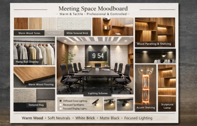
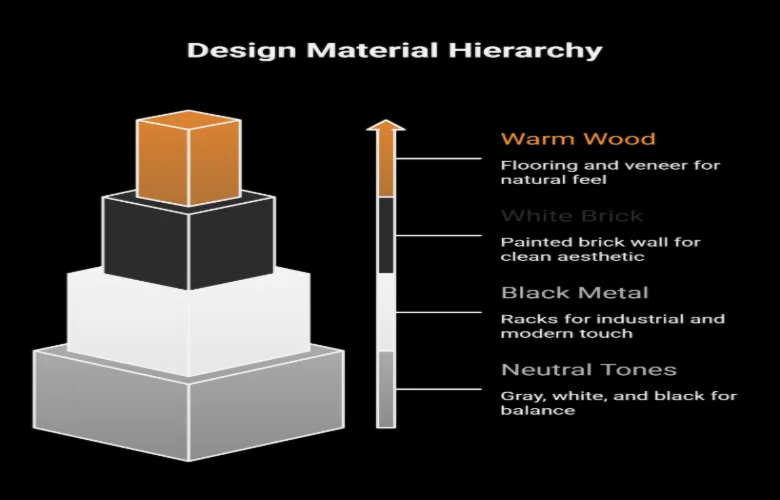
Materials selections have been guided by this rationale. The overall visual quality of the space has to remain minimalistic, so that fabric, color, texture of clothing can be the focal point. On the other hand, the space cannot appear sterile. White brick, wood, layered lighting were introduced into the design to create a controlled yet tactile environment allowing clients to interact physically with the product(s).
The end result is a space that facilitates critique, presentation and commerce concurrently. Creativity and commerce do not have to exist in separate environments. They can exist together in a continuous manner.
Project Insights:
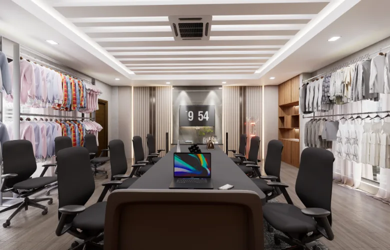
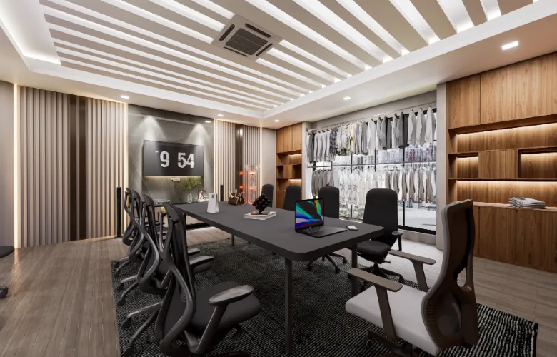
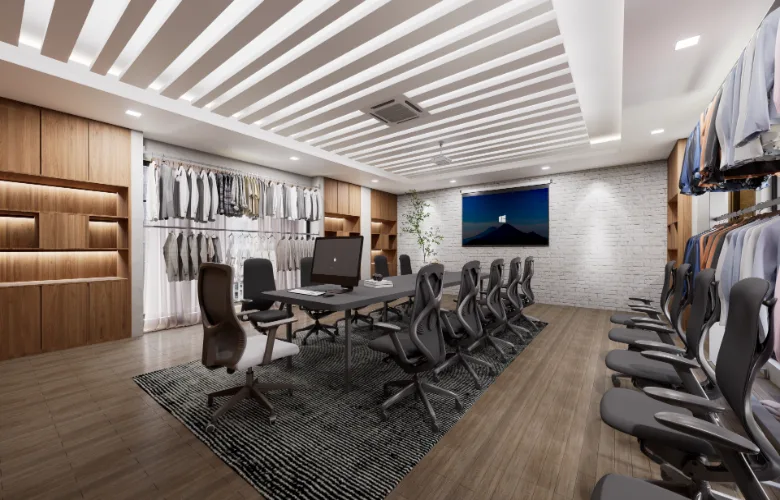
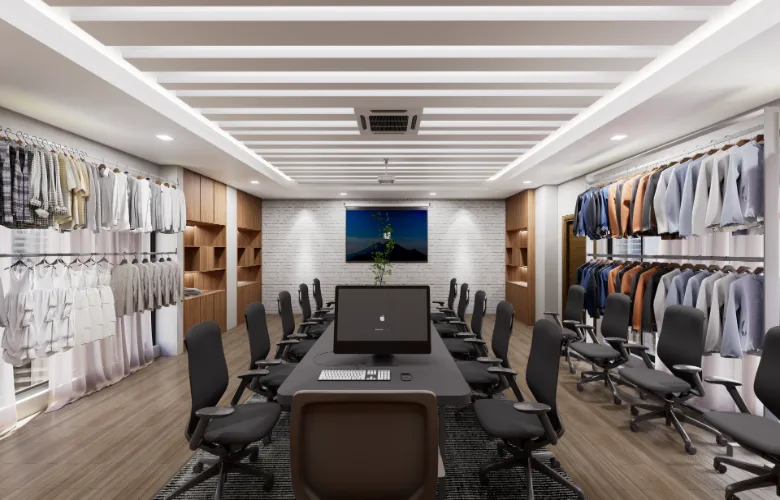
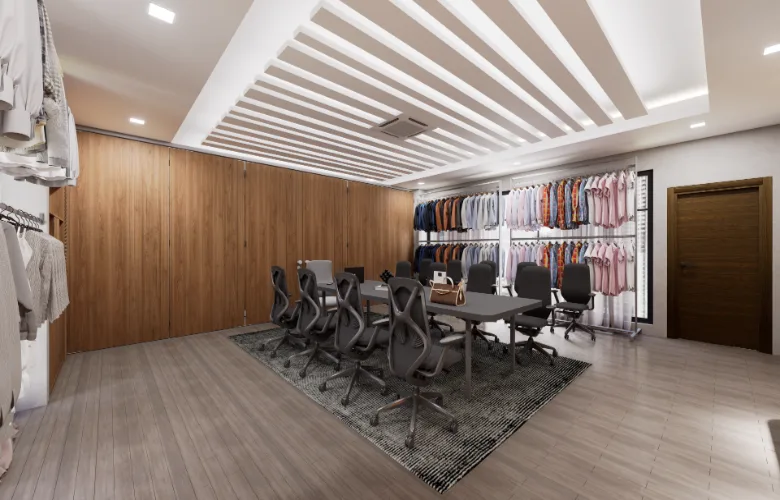
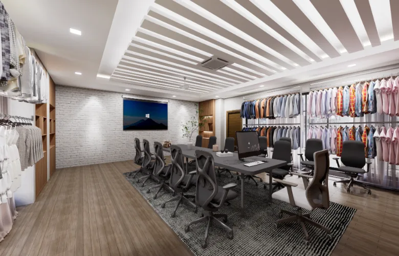
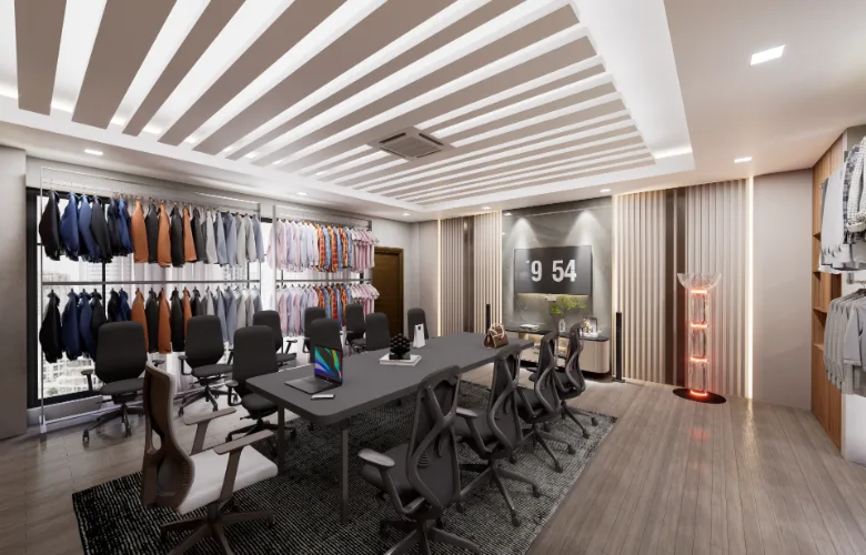
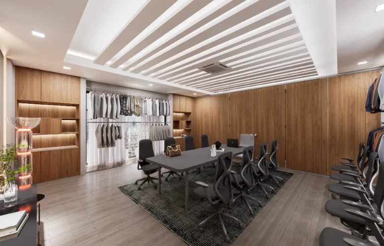
- The conference room has a central table that provides all participants at the same time equal opportunity to see the two displays.
- The continuous, wall mounted garment racks are used to create vertical opportunities to show the apparel on the walls and do this without obstructing the path or creating too much congestion.
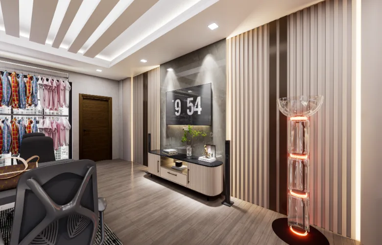
- The slatted ceiling is a way to provide lighting and create a sense of height by visualizing the ceiling.
- A neutral material selection was made to avoid distorting the colors of the garments being reviewed.
- The white brick feature wall adds some texture but does not compete with the displayed products.
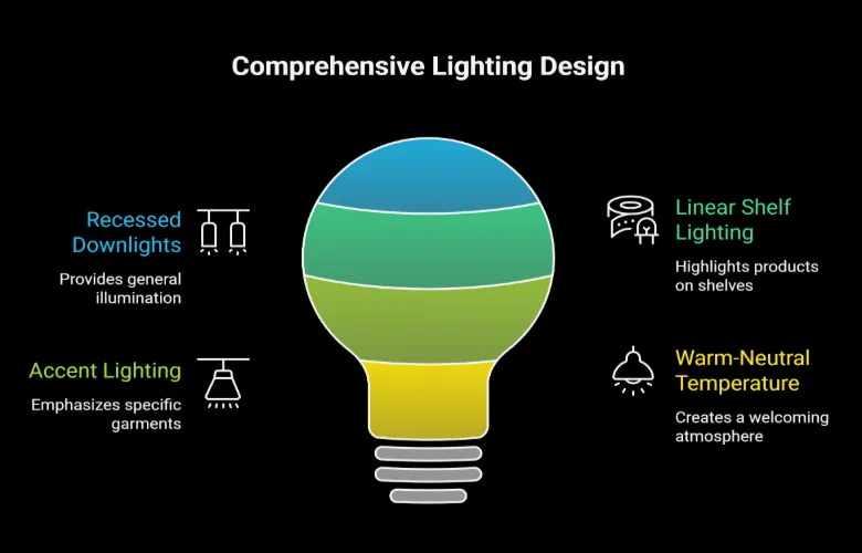
- There is a layered lighting plan to compensate for the low amount of natural light entering into the space.
- There is a rug placed under the table defining the area where people will be sitting in meetings. The rug creates separation from other areas of the space but still allows for free movement throughout the entire space using no physical barriers.
- There are built-in shelves in addition to providing storage for flat samples they also can serve as illuminated display cases for folded sample pieces.
- The softening of acoustics within this hard surface space were accomplished through use of fabric components (the rug and chairs).
Design Details:
Interior Design Strategy: Linear organization is utilized by placing the large, central conference table in order to ensure equal traffic flow around each side of the table. In addition, continuous display rack runs along each wall; thus, all seats have an unobstructed view of the merchandise.
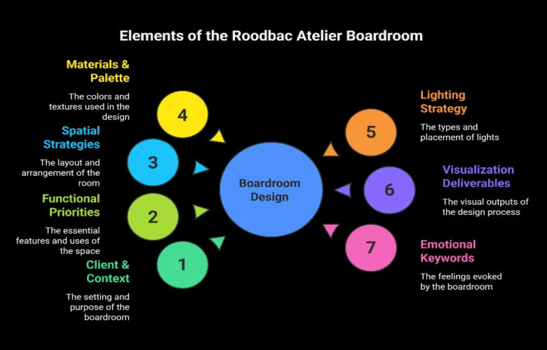
Finishes & Materials: A warm wood veneer and flooring provides a stable foundation, while the use of white-painted brick adds texture and tactility. A black metal display rack offers a durable and contrasting surface area for displaying garments. A matte finish on all furniture reduces glare; this becomes especially important when using screens or giving presentations.
Lighting & Atmosphere: Layered, focused lighting has been used. General lighting was provided through recessed down-lights, while LED lights were integrated into the shelves and garments. By focusing light, it helps to create accurate color representations of fabric, which creates consistency between viewing product images on computers/screens and how they appear in person.
Color & Texture: A simple color scheme consisting of wood, white, gray, and black will allow garments to be the visual focus. Texture has been used as a strategic element—brick for creating depth, rug for softness, and metal for sharpness—to create a well-rounded sensory experience within the space.
Furniture & Construction: The custom-built conference table includes built-in computer displays that are easily connected to support presentations without clutter. Storage has also been included via built-in shelving at each end of the table to keep the perimeter clear of clutter while providing ample storage. The ergonomic chairs will help users remain comfortable during long periods reviewing products.
Visualization & Experience: Visualizations of the design (e.g. still images and 360° walk-throughs) provided a very high level of detail to help the client understand how the space would function, including the ability to test layout options prior to build-out; verify lighting effects; and determine the number and location of displays relative to circulation paths and brand identity.
How do you combine a showroom and meeting space in a small area?
A: By avoiding physical separation and instead organizing functions linearly. In this project, display and discussion coexist along the same axis, ensuring efficiency without fragmentation.
How is garment visibility maintained during meetings?
A: Display racks were positioned along both walls, keeping all items within sightlines from the conference table. Lighting was calibrated to highlight garments without glare.
Did the narrow space limit functionality?
A: It was used advantageously with a central hallway that organizes circulation and creates visual openness while connecting functional areas.It introduced constraints, but also clarified the planning approach. A central spine layout ensured smooth circulation while maximizing usable wall area.
How were lighting conditions controlled for accurate fabric color?
A: A warm-neutral lighting temperature was used, avoiding overly warm or cool tones that could distort color perception during reviews.
What role did 3D visualization play here?
A: Yes. Recessed LEDs and careful furniture selection prevented a cramped feeling while maintaining a professional, organized look.Visualization allowed the client to test display density, table proportions, and lighting impact before construction—reducing revisions and speeding up decision-making.
Can this concept scale to larger showrooms?
A: Yes, the same logic can expand into zoned layouts, where multiple discussion areas are paired with dedicated display sections.
How were acoustic issues handled in a hard-finish space?
A: Soft elements like rugs, upholstered seating, and shelving helped absorb sound, improving comfort during conversations without compromising the aesthetic.