Client:
Omar Faruk
Project Type:
Residential Interior
Location:
Basurhat, Companiganj, Noakhali.
Duration:
1 month 24 days
Area:
2,120 sq.ft
Project Overview:
Omar Faruk’s 2,120 sq.ft Basurhat, Companiganj, Noakhali residential interior space was completed within 1 month and 24 days deadline. The purpose of the project was to develop an inclusive home space that blends daily routines with social interactions in harmony. Rather than focusing on dramatic effects via materials and lighting, the design creates a calming space by balancing contrasting use of materials and varying lighting levels to provide a peaceful and functional home environment. The defining characteristic of the project is its ability to divide elongated, multi-function spaces into defined, comfortable zones without separating them physically.
Project Story
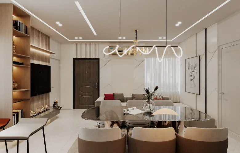
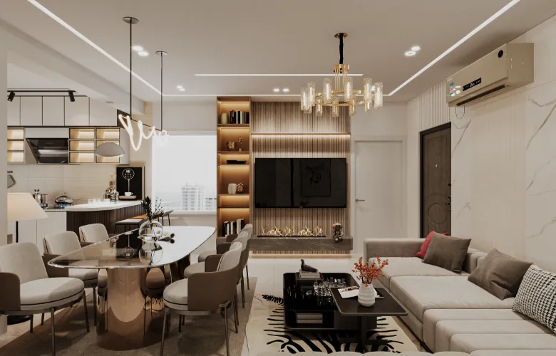
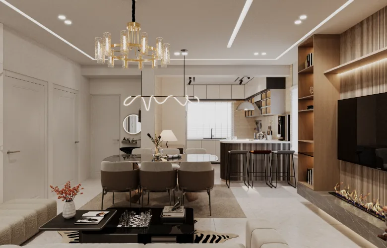
The issue at hand was not a question of available square footage; it was one of ratio. Due to their linear nature, several zones — namely the living, dining and kitchen — were at high-risk of becoming a “corridor” like space instead of a cohesive home. Additionally, the client needed these various uses to be able to coexist: family lounge use, dining use, entertainment use — all with visual connectivity.
The response was intentionally conservative. Instead of dividing the space with wall partitions, the design utilized visual pacing. Visual pacing was accomplished through ceiling treatment, variable lighting intensity and furniture orientation to create breaks in the length of each zone so they could be read separately. However, although each zone felt separate and defined, they remained visually connected.
The fire place and television unit anchored the living zone while the dining zone acted as a transition zone versus being a completely separate zone.
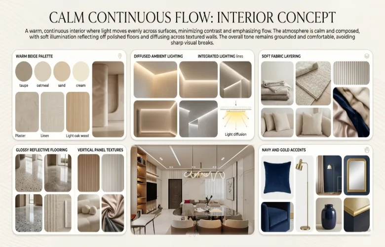
To further support the strategy of utilizing visual pacing, the choice of materials and colors reinforced this approach. Warm neutral tones dominated the overall look of the space to promote continuity. Darker accent tones were used selectively throughout the space to identify focal points. Artificial lighting was not viewed as a substitute for natural daylight in those areas with limited natural daylight; it was treated as another primary layer in designing the mood in those areas regardless of what hour it was.
Project Insights:
- Utilized ceiling treatments and varied lighting levels to divide long spaces with no wall separations.
- Placed TV/fireplace unit in a location to act as a visual anchor to stabilize the living zone.
- Designed dining zone as a transitional zone between the living zone and other adjacent zones.
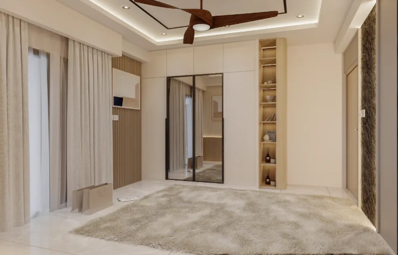
- Incorporated built-in storage units along walls to prevent clutter caused by furniture placement due to the narrow proportional space.
- Used warm lighting to help compensate for uneven natural daylight availability across individual zones.
- Used vertical grooved panels with backlighting to add depth to the space without taking up valuable floor space.
- Maintained a neutral color palette to ensure visual continuity when viewing elongated space arrangements.
- Added glass components in wardrobe doors and shelves to increase the perception of openness in narrower zones.
- Kept all furniture low profile to allow horizontal visual flow to remain intact.
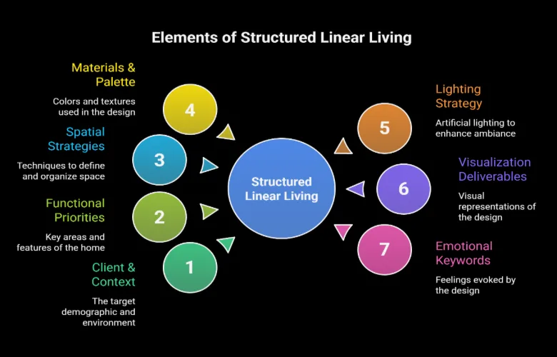
Design Details:
Space Planning:
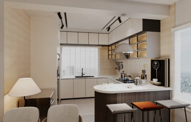
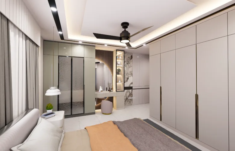
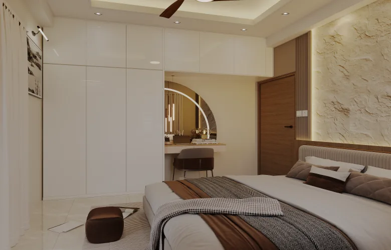
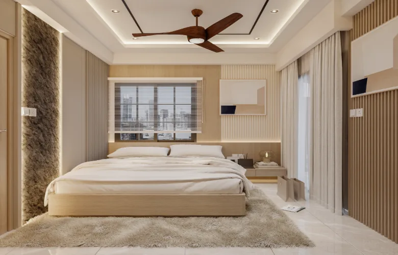
The space planning approach addressed issues related to elongated space ratios by breaking down functions into distinct areas based on visual cues vs. actual barriers. Although the living, dining, and kitchen zones are aligned vertically, they are differentiated from one another based upon direction and focused features. Bedroom zones are maintained smaller in scale and are more contained or private compared to public zones.
Materials & Finish:
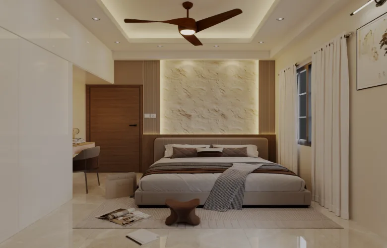
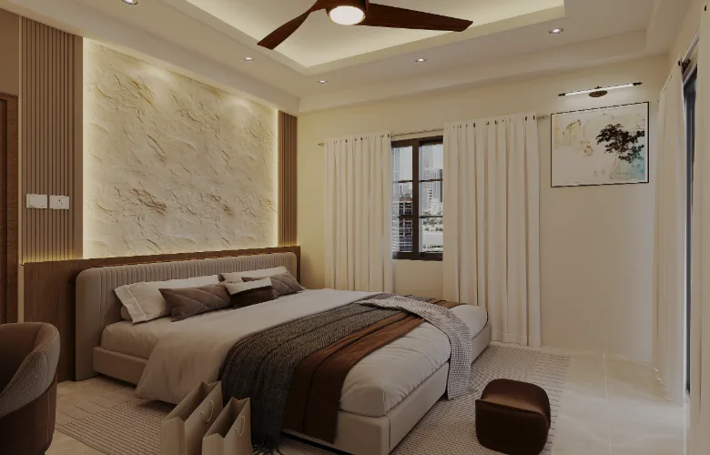
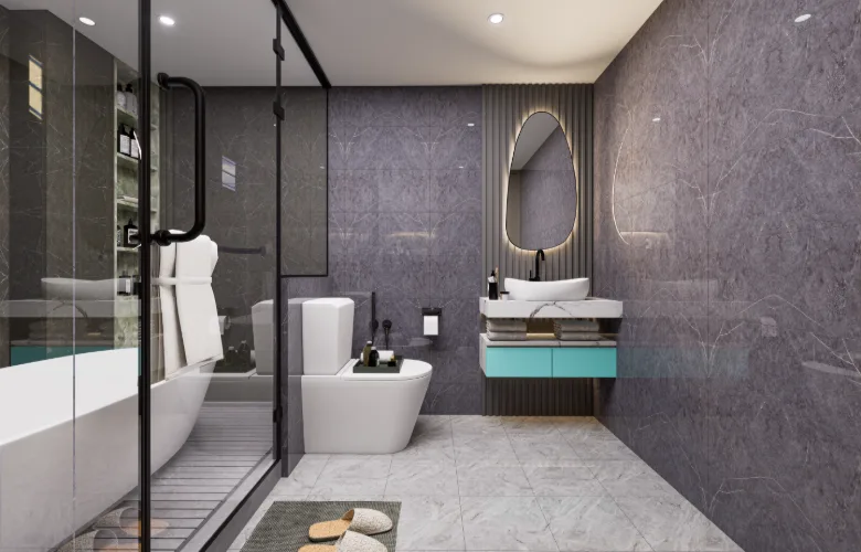
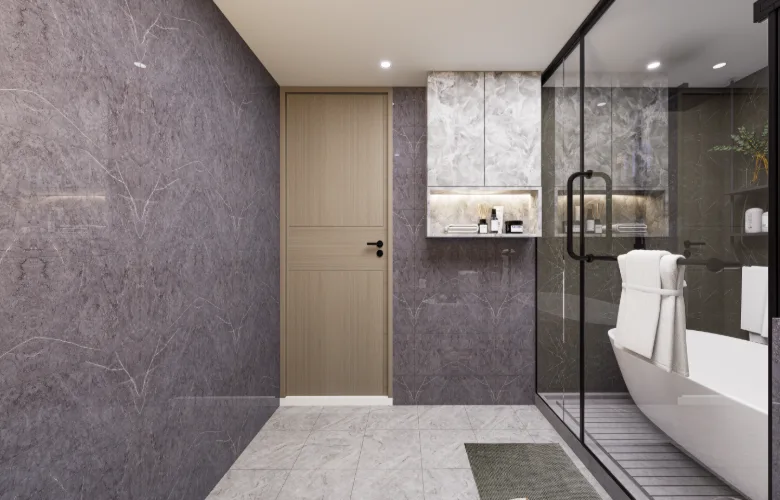
The finish selections enhance light reflection and distribution throughout longer spaces, which helps reduce the appearance of compressed zones. Rhythmic variations exist in wall finishes (i.e., texture) as well as smooth finishes to create additional interest. Wooden features are strategically incorporated into the design to create a sense of grounding to an otherwise pale tone scheme.
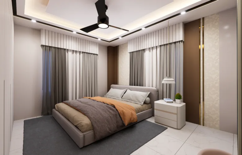
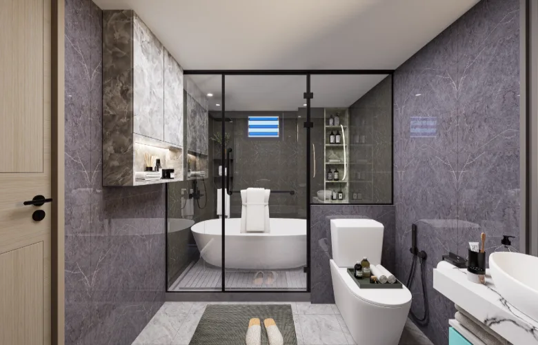
Lighting & Ambiance:
Lighting played a major structural role in this project. Cove lighting and recessed fixtures provided general ambient lighting, while pendant and chandelier lighting created focal point definitions in designated zones. Consistent warmer color temperature usage was employed throughout to counteract cooler tones produced by glossy finishes and provide a more residential atmosphere.
Color & Texture:
The selected color palette is tightly controlled and layered; beige, taupe, and cream served as a foundation with navy and gold accents providing contrast. Deliberate but muted texture variation included combination of matte panel finishes, reflective flooring surfaces and soft textile finishes to provide variety without visual clutter in continuous sightline conditions.
Furniture & Joinery:
All furniture items were chosen with consideration given towards scale to minimize interruption of movement within elongated spaces. Custom joinery provided integral storage, display and media units within singular systems thereby minimizing number of freestanding furniture items. Simple lines and minimalist detailing minimized distractions from visual field.
Visualization & Experience:
Photorealistic still renderings and select perspective view illustrations were created to evaluate clarity of zoning boundaries and balance of lighting levels. These illustrations assisted the client in understanding how elongated spaces would perform realistically and specifically how individual zones would feel separated by common visual boundaries rather than physical ones. The elimination of ambiguity surrounding implementation of design intent during construction phase allowed for improved correlation between conceptualization and final product delivery
How to stop the perception of hallways when the house is very long and skinny?
A:The solution here is to remove barriers (walls) and create a sense of area using different types of lighting, ceiling treatments and furniture layouts to create separate “reading” areas within one open area.
If some rooms are too dark to get sufficient sunlight, how did you address this issue?
A: Artificial lighting was used as a main source of illumination as opposed to secondary. Using variable intensity and color temperatures allowed us to maintain consistency in the level of comfort throughout the entire house.
Is it realistic in this climate to combine a television cabinet with a fireplace?
A: Yes, In our situation the fireplace was used as an accent piece which provided focus point in addition to providing a depth cue. We didn’t require fire place to function as a heat source.
How do you prevent the open-concept space from getting cluttered?
A: Built-in cabinetry and built-in shelving reduced the amount of freestanding furniture needed, which improved usable space while maintaining clean lines of site.
Can your method be adapted for later changes in furniture or decor?
A: Yes. Since the basic design elements were neutralized, there will always be opportunity to add new colors and patterns to enhance design.