China Shopping Mall – Interior Design, Jamuna Future Park
Client:
Adil Khan
Project Type:
Commercial Interior
Location:
22B& 22C, Level -03, South Court, Jamuna Future Park, Dhaka -1229
Duration:
28 days
Area:
975 sq.ft
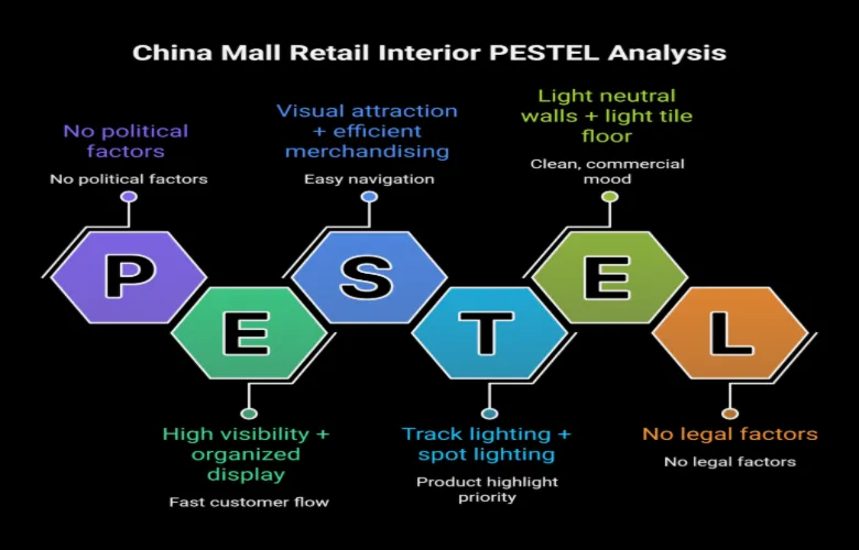
Project Insight: China Mall Retail Interior | Jamuna Future Park
Retail interior for Adil Khan, Jamuna Future Park 975 sq.ft Units 22B & 22C, Level -03. This project was completed in 28 days. It focused on creating an environment for a high density of retail spaces which didn’t compromise clarity or comfort. The goal was to create a visually appealing shopping environment that made the merchandise the main point of interest. All aspects of the interior design were created to ensure every aspect of the design supported the primary objective of product visibility and customer navigation.
Project story:
This wasn’t about too little content there was too much. The client had a large number of products they wanted to showcase, and we had to create a shopping environment that could show all these products without overwhelming the shopper. We had to find ways to organize so many products.
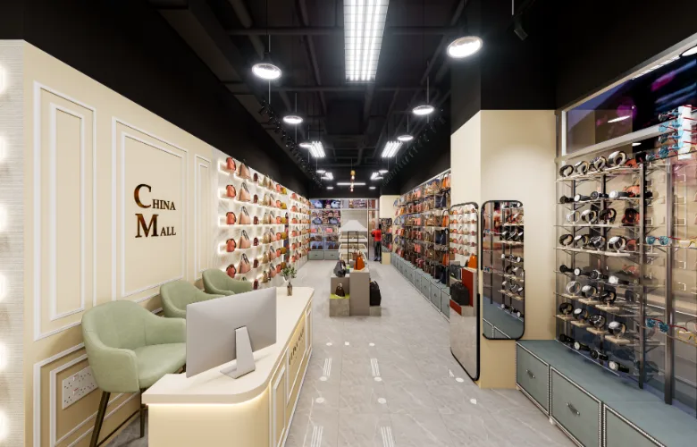
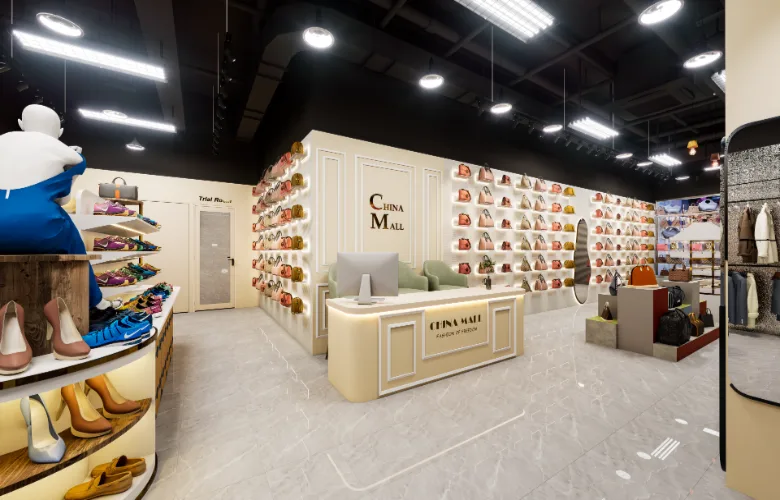
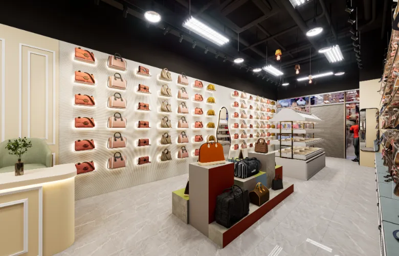
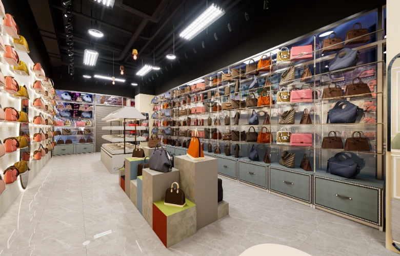
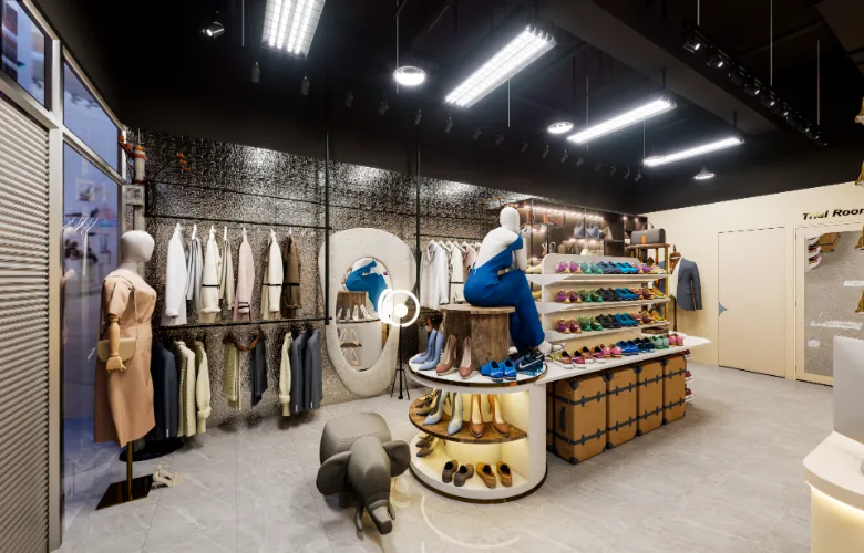
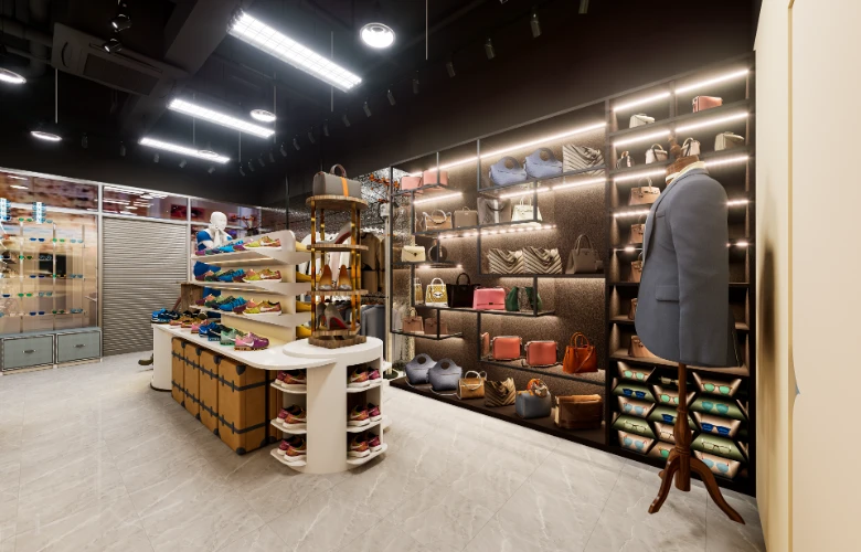
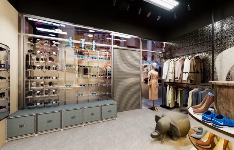
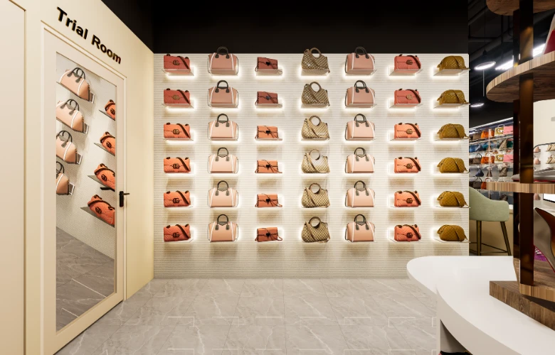
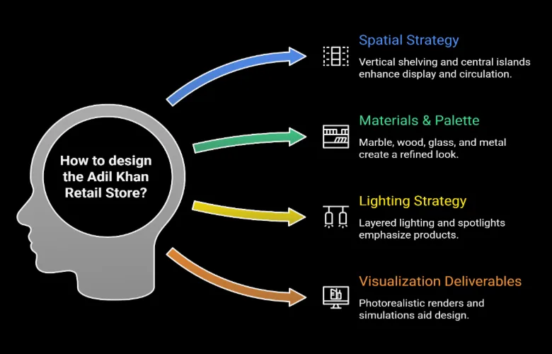
We started by using shelving logic. Display walls were created vertically to allow more floor space for shoppers and the center island was sized to be small enough not to block view lines. We did not treat each product equally; we created a hierarchical structure in the space where high-impact products are displayed on feature walls, volume products are displayed on lower level shelving, and mannequins were used to demonstrate style options.
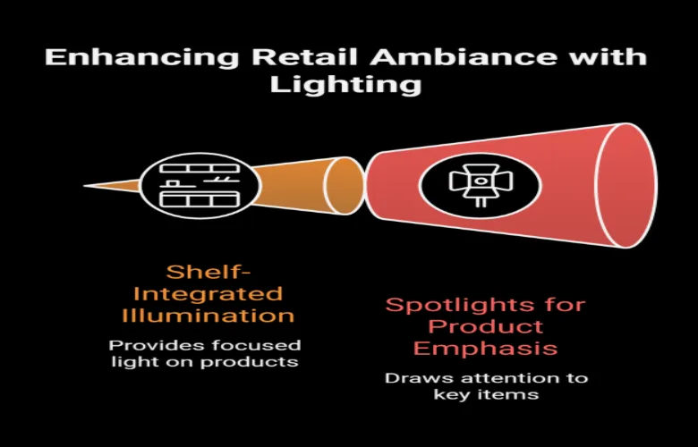
Lighting was also very important. Since we have very limited natural light, artificial lighting was used to provide brightness AND direction. Lighting in the form of integrated shelf lighting and spotlights draws the shopper’s eye to specific areas of the store, directing them gently throughout the store.
The final retail environment is organized well, yet flexible. Shoppers can shop easily from one area to another and at the same time, the organization of the space has subtlely directed the shopper’s eye – reducing decision fatigue and making the overall shopping experience better.
Project insights:
- Vertical shelving maximizes available floor space while keeping foot traffic flowing.
- Proportionate center display units enable unobstructed views across the entire store.
- Shelf-mounted lights increase visible product without adding additional fixture elements.
- Base color scheme is neutral to keep merchandise as the shopper’s first impression.
- Mirrors are strategically placed to enhance spatial perception, and aid in fitting trials.
- Product tiers create a visual progression, enabling easy scanning by the shopper.
- Embedded trial rooms into the floor plan do not impede the normal flow of retail traffic.
- Durable finishes minimize future upkeep due to heavy shopper activity.
- Directional zoning of lighting aids shopper movement and attention.
- Organization of product display eliminates product clutter in dense product environments.
Design details:
Space planning:
The space is arranged around a central circulation route, which enables shoppers to travel through different product categories seamlessly. Bulk product storage occurs along perimeter walls while centrally located fixtures serve as focal points. Trial rooms are positioned near the back of the store to preserve shopper privacy while still supporting browsing.
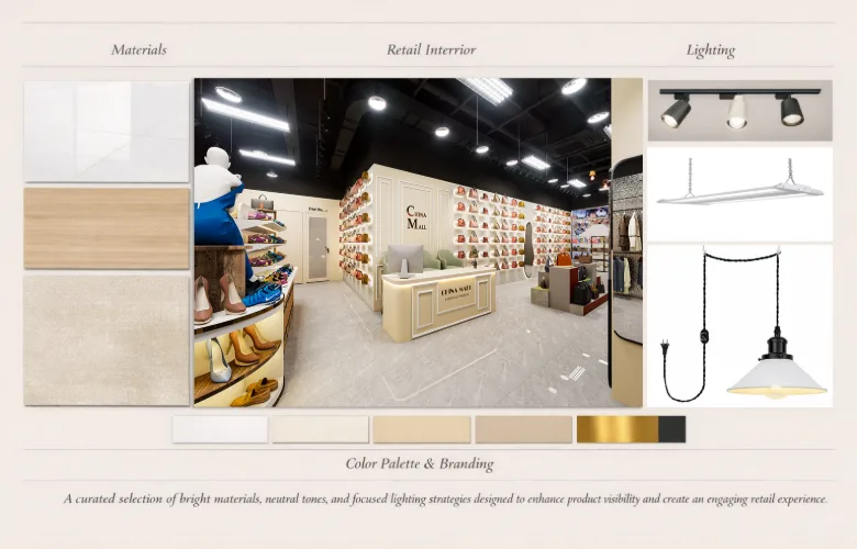
Materials and finishes:
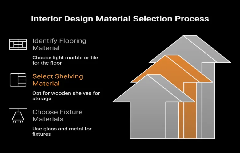
Polished tile and/or marble flooring reflects existing lighting to produce brightness. Wood shelving adds warmth and contrasting texture to the lighter-toned base. Glass and metal components are incorporated into display fixtures to achieve a modern/contemporary retail aesthetic.
Lighting/atmosphere:
An entirely artificial lighting system provides consistent brightness levels throughout the store. General lighting comes from recessed ceiling fixtures while shelf lighting and spotlights call attention to key products. The temperature of the lighting is balanced so that colors will be presented accurately without glare.
Color/textures:
The interior features a restrained color scheme — beige, cream, light stone — as a neutral background for colored merchandise to compete for attention. Smooth reflective surfaces are offset by soft textiles found in seating and decorative accessories.
Furniture/joinery:
Units of custom shelving have been engineered for flexibility — able to accommodate varying size products. Tiered central display tables and pedestals enhance visibility. Seating/counters are situated so as to facilitate both service interactions and short-term shopper engagement without congestion.
Visualization/experience:
Design development occurred through photorealistic renderings of the space focusing on product presentation, lighting behavior and shopper movement. These rendered images enabled the client to assess how products would look under actual viewing conditions, resulting in accurate decisions regarding shelving height, lighting placement and circulation. As such, the project was executed efficiently with minimal site revisions.
How do you design a store that sells lots of product types but doesn’t make shoppers feel lost?
A: By creating a clear display hierarchy feature zones, secondary shelving and focal points—so that shoppers can process information gradually rather than all at once.
What makes for ideal lighting in fashion retail interiors?
A: General lighting for the products to be visible, with the important things specially highlighted. Everything must be visible, but you require an emphasis on the things you want to focus the shopper’s attention on
How do you get customers across the whole store?
A: Circulation paths are dotted with visual clues like display and lighting trickery to get the public moving intuitively without having to nag them with signs in their faces
Are neutral interiors always better for retail?
A: Neutral is good for multi-category stores, to avoid visual conflict and allow the products to suggest the colour identity.
How do you fit trial rooms in without compromising the layout?
A: Hey are tucked towards the back or skirts, so that they are still easily found
How did visualisation improve this project?
A: They could play with display density and see the effect of lighting on lightness and shade and how customers moved through the space without having to go through the messy and expensive changes in layout at time of execution .
Can your design approach work in seasons where products are often changed?
A: Yes, we work with a modular shelf, and display unit approach so it’s easy to change the look of the store in terms of layout and product focus.